360 Learning
iOS app
360Learning is a Collaborative Learning platform trusted by 1,200 customers worldwide including LVMH, AXA, Lego & Criteo.
YEAR : 2021-2022
ROLE : PRODUCT DESIGNER
Context
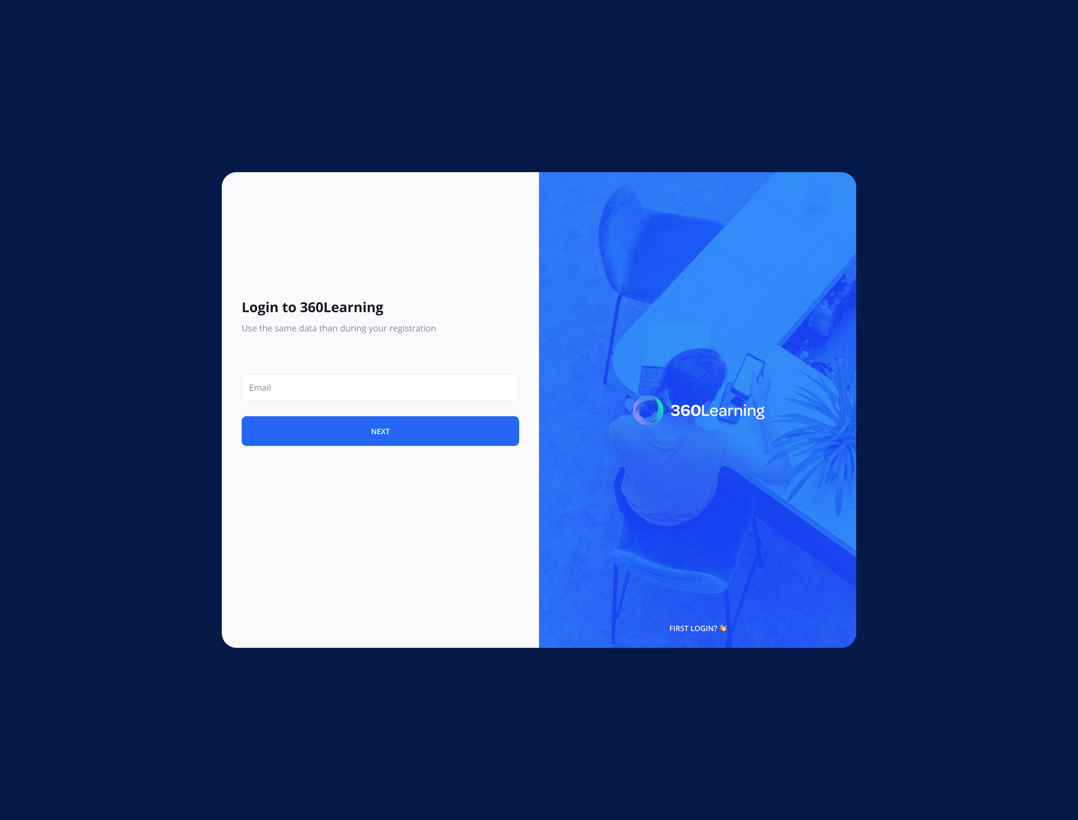
Historically, 360Learning has always been a web product, with all major features on Desktop.
On desktop, we have two major roles :
The learner can see the courses, play courses and programs, chat, ...
The Coach or admin can create courses, watch datas regarding their learner, answer to question,...
This product is not a mobile first project. All new features are coming on web first, and then on mobile if the bandwith is okay.
However, we had a mobile app that was part of the product, but the goal was more to have a possibility to play courses on mobile than to have a dedicated experience on mobile, with a dedicated and strong mobile UX.
The product team wanted to have a dedicated product designer on mobile and tablet apps, in order to have a real experience for 360Learning on mobility.
My main objective was to create a coherent and user friendly app that can help learners to follow their courses on mobile and additionally help 360learning to win some new mobile deals.
Process
Each work I did for 360Learning is done with Figma and try to follow a clear process :
 Define the why before the how. Why are we doing this, why our learners want to do that, etc...?
 Discoveries with Users and business feedbacks collected
 Wireframes and User flow
 UI and design system
 Prototypes low fidelity (figma) and / or high fidelity (Principle)
 User tests Virtual (Maze) or in person
 Tickets creation on Github and review
 Data (Amplitude) to analyze and optimize the design
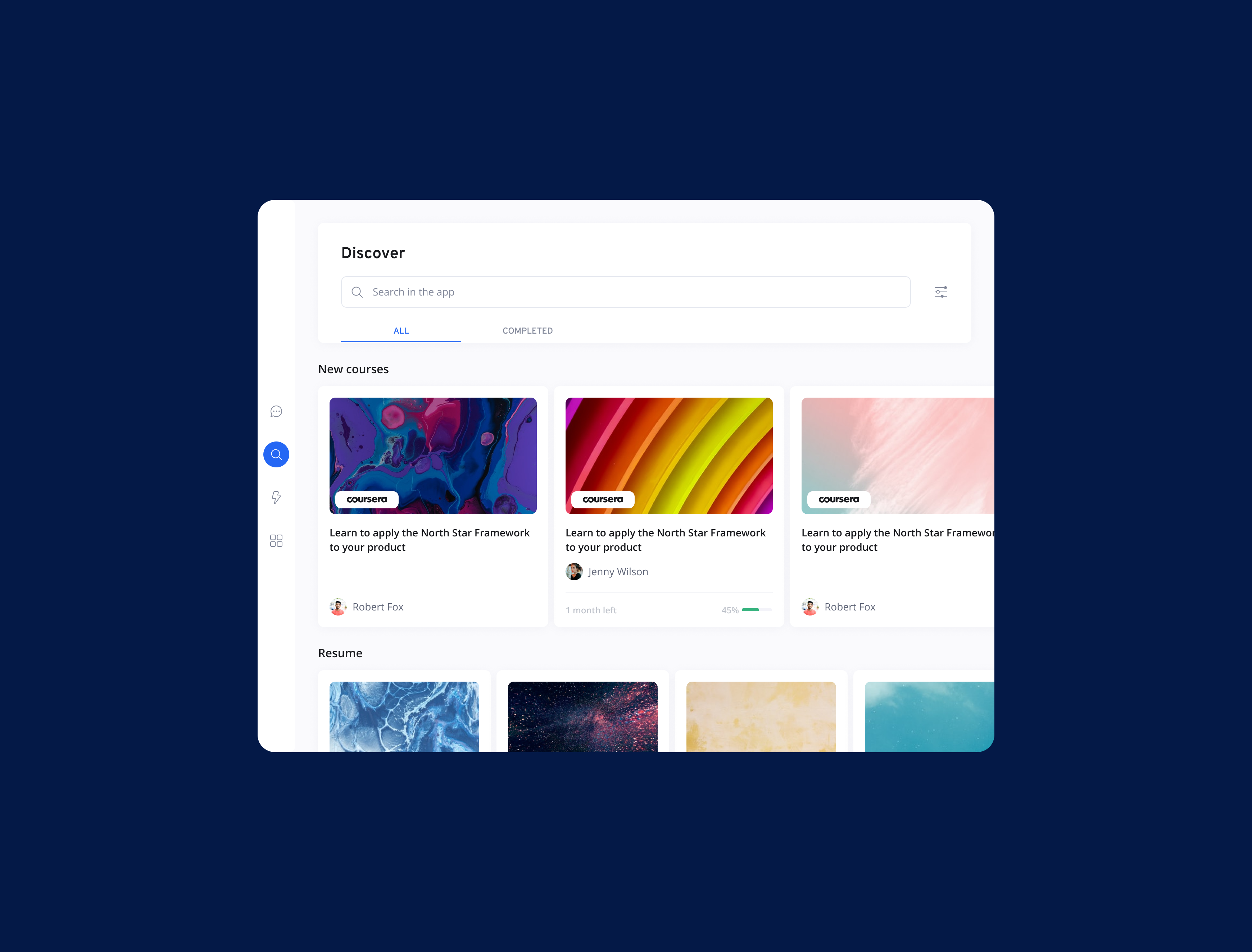
My Work
Coming to a new product already developed is always difficult. Even more with 360Learning that a so many features and so many use cases.
In order to understand how things work on the product, I took the first weeks trying the entire product, and then mapping all the mobile screens. It helps me to understand better what we can do in the app, what we can't do, and what we should increase (what are the blocking points).
Based on this mapping and all the datas I had, and after discussions with the Product Manager, we decided to define what were the keys elements to rework for the app.
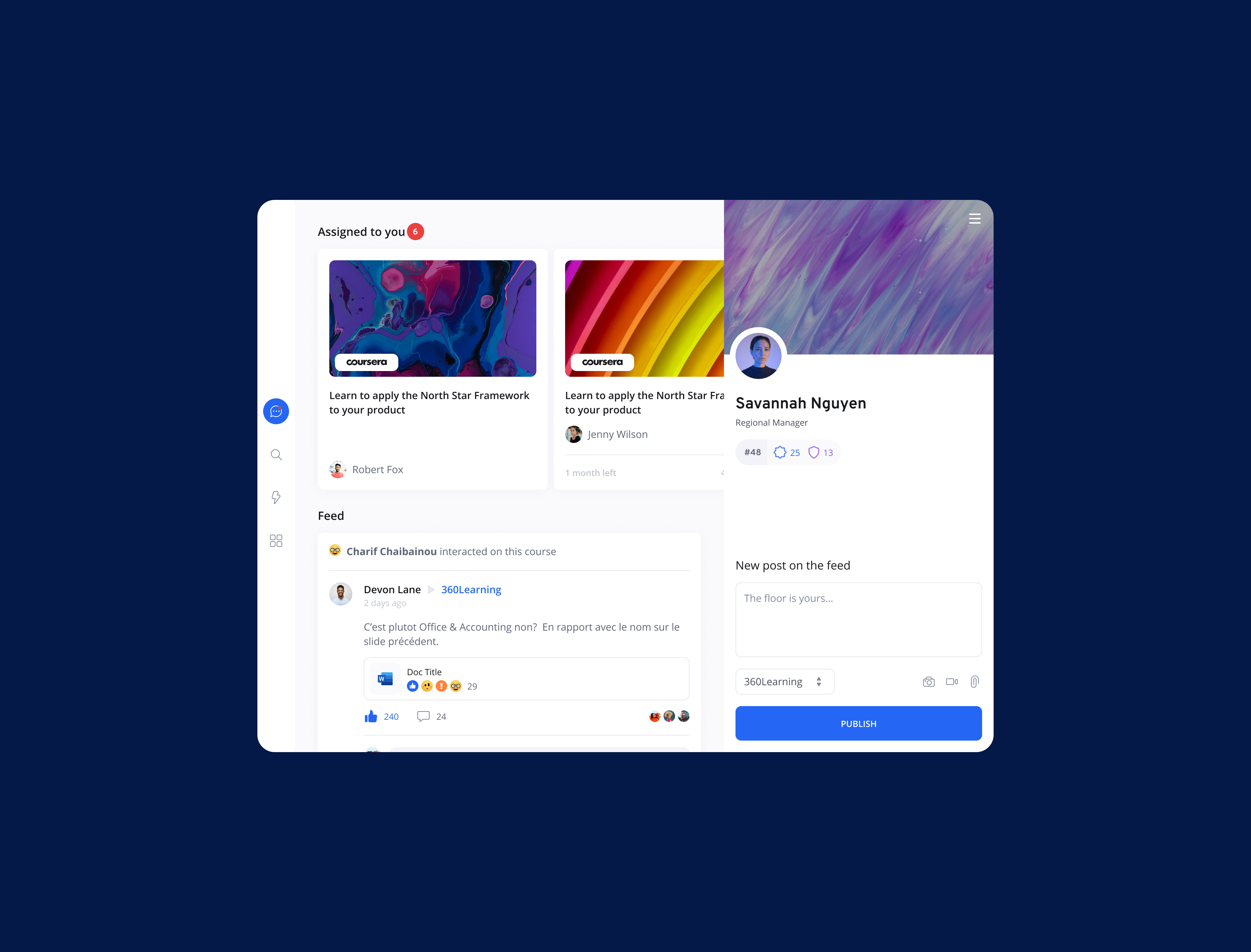
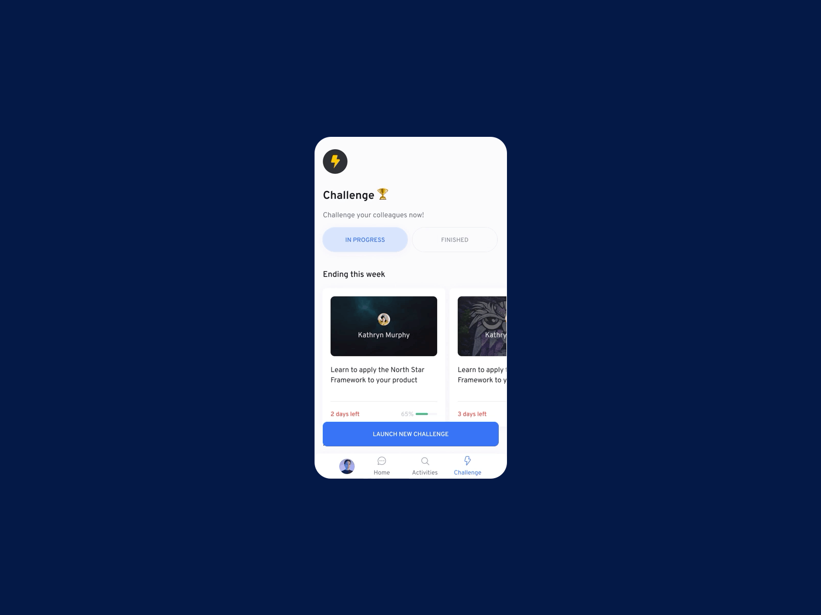
1. Redesign and new navigation
Problem
The app was not UX friendly. Different ways to navigate conducted the user to be lost, and the app was not easy to find something(based on discoveries meeting with learners and in house). The navigation and hierarchy was really bad and conducted to a new redesign.
Solution
We decided to reorganize all the app and to create a clear tabbar with clear section to simplify the usage. We decided to be minimal to highlight as much as possible the content.
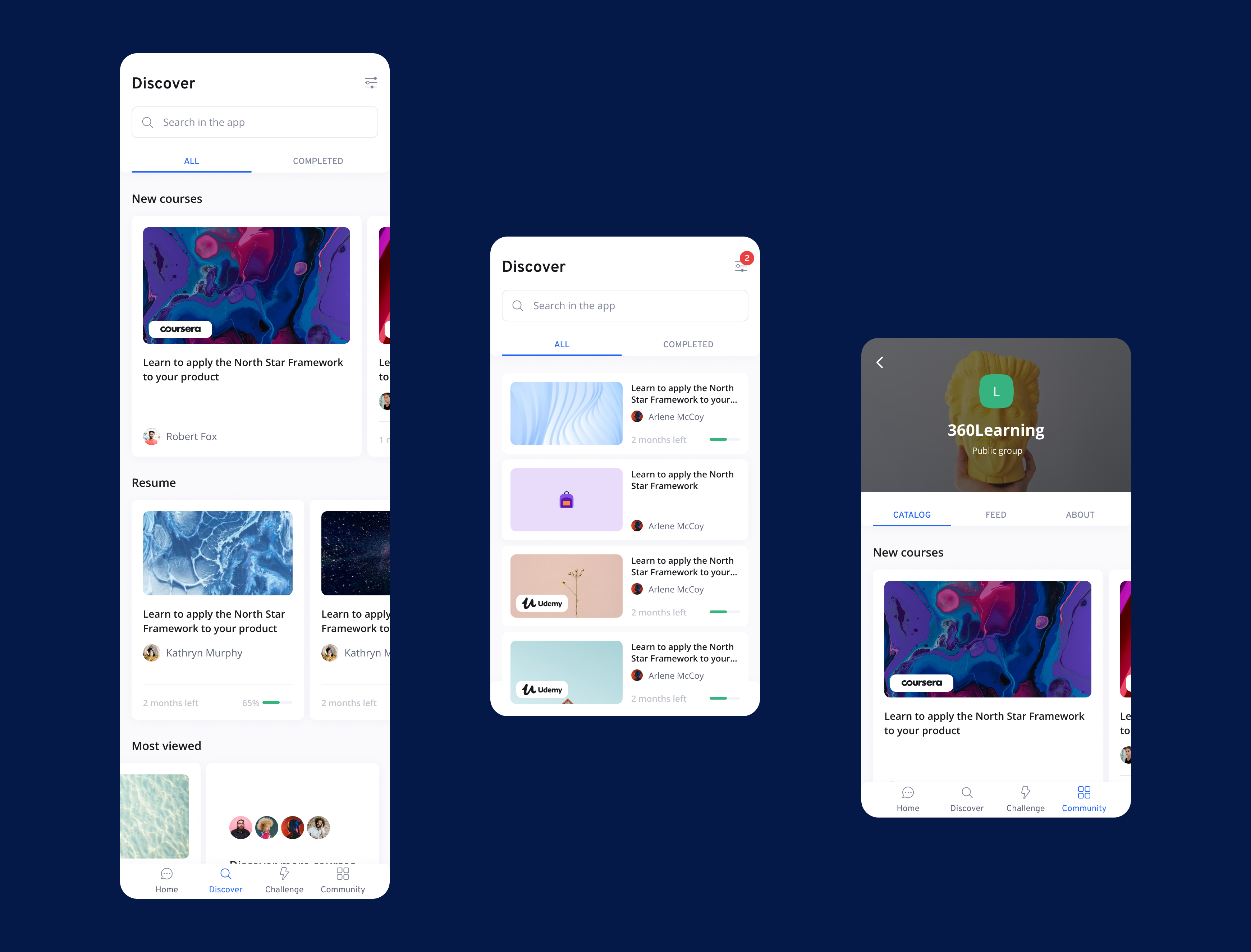
New design
New design
Key Results
We decided to track the mobile active users during few months to see if the design was a success. Based on this data, we multiplied by 3 the number of mobile active users (both OS).
This number is also related to business won on mobile thanks to this new design, more clients meaning more active users. We also made few improvements on the navigation in order to reduce some blocking points.
2. New player with dedicated UX for Mobile
We call Player all the activities when a learner is playing a course or a program. It can be text, video content, or questions to answer.
Player is the most important part of the product, and there is a lot of different activities available.
Problem
Actually, the player for mobile is the same as on desktop. Not mobile friendly, and unadapted components.
Solution
In order to increase the usage of the app, we need to create a new player thought for mobile. New ways of answerings, new interactions, etc... but also new UI with dark background. The idea behind that was to increase user focus and reduce distraction when he is playing a course. Furthermore, we wanted to differentiate visually the navigation between pages and the player with the UI to understand quickly when a learner is on a course or no.
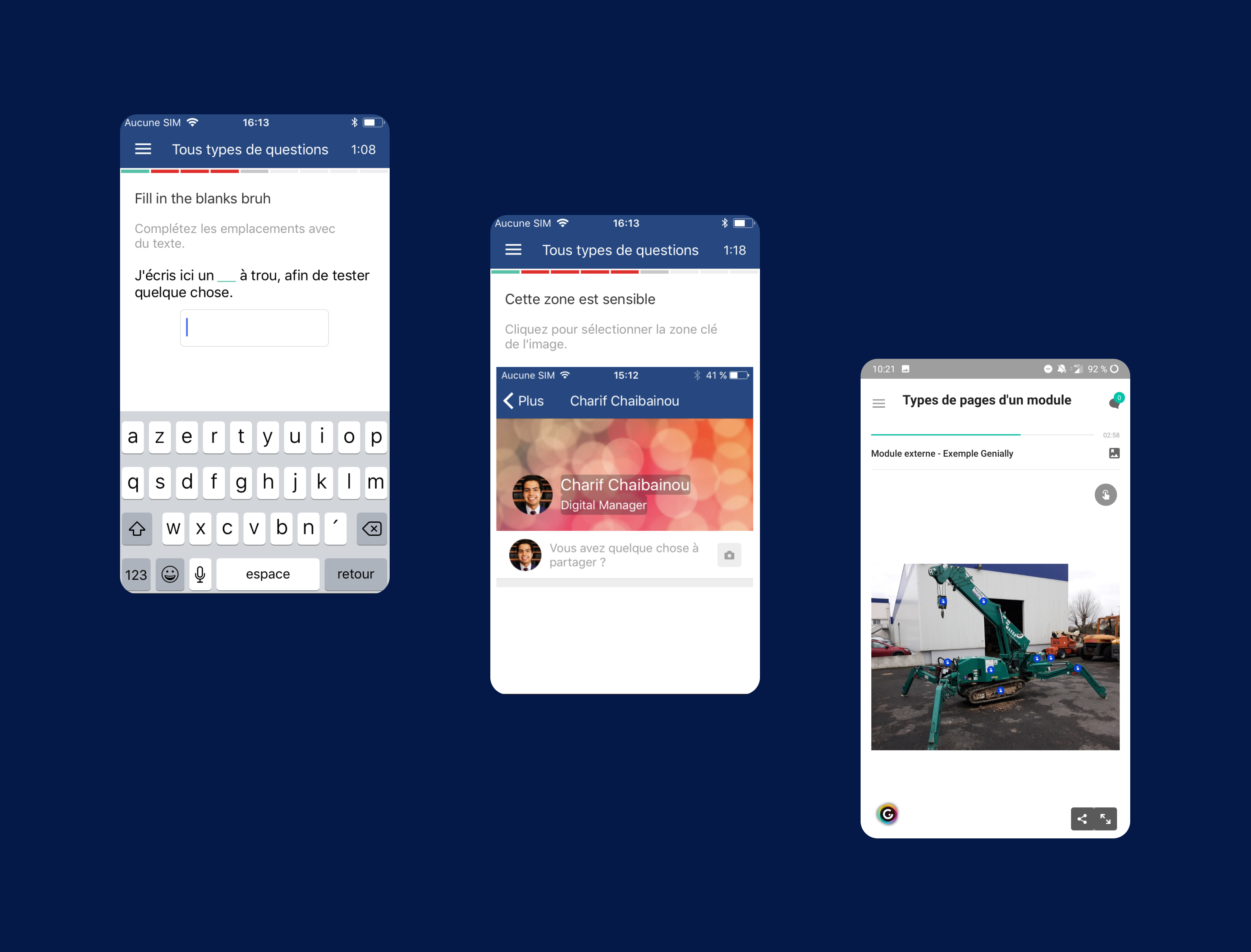
Old design
Session page and course page
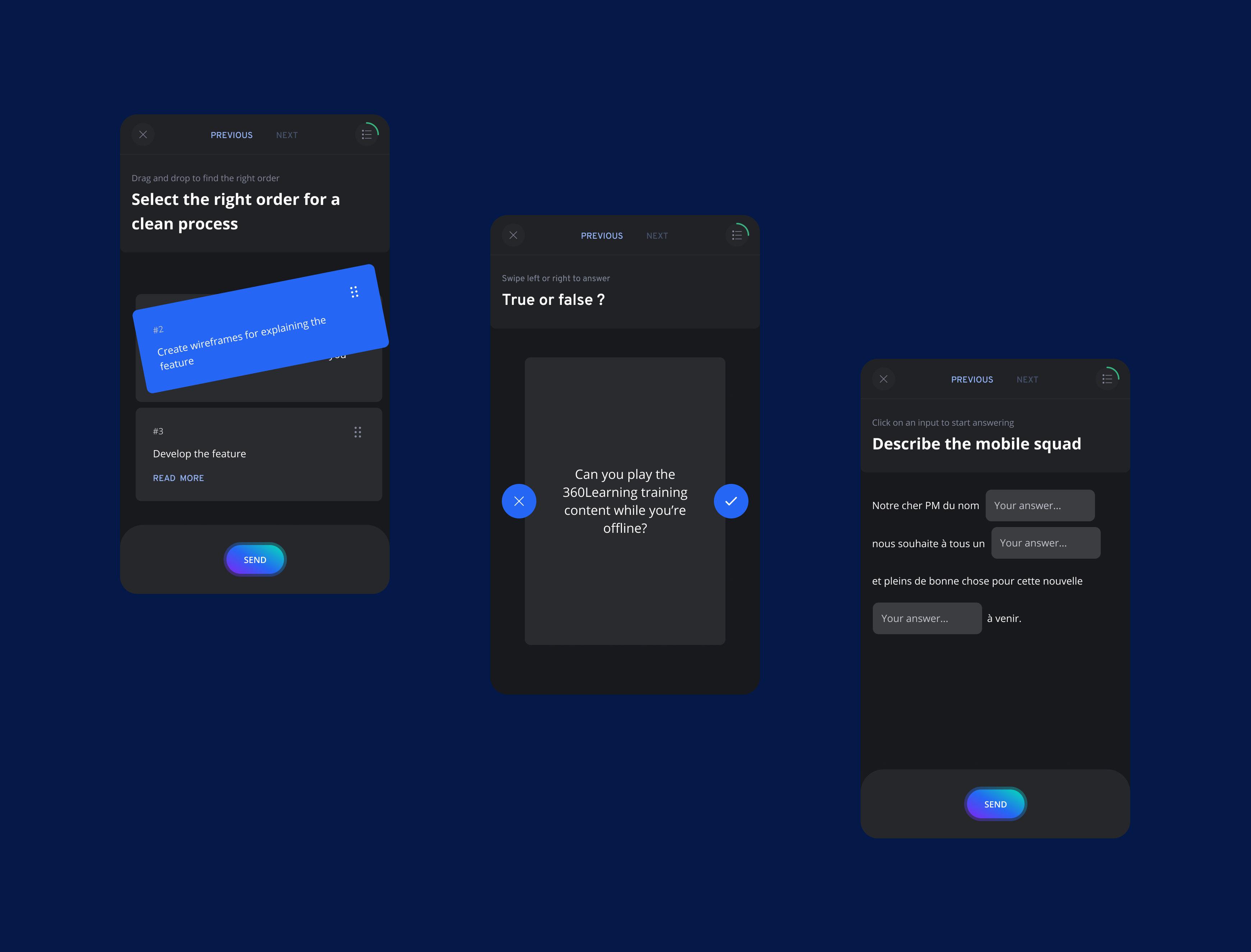
Question type : Reorder, True or false, Fill the blank
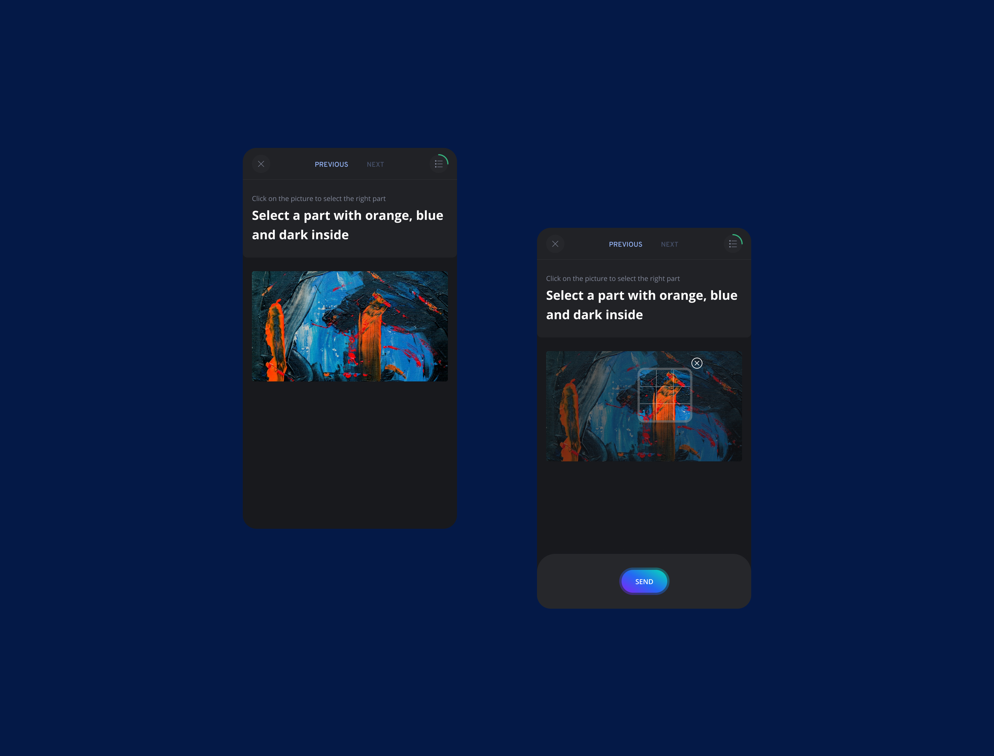
Pick a point question
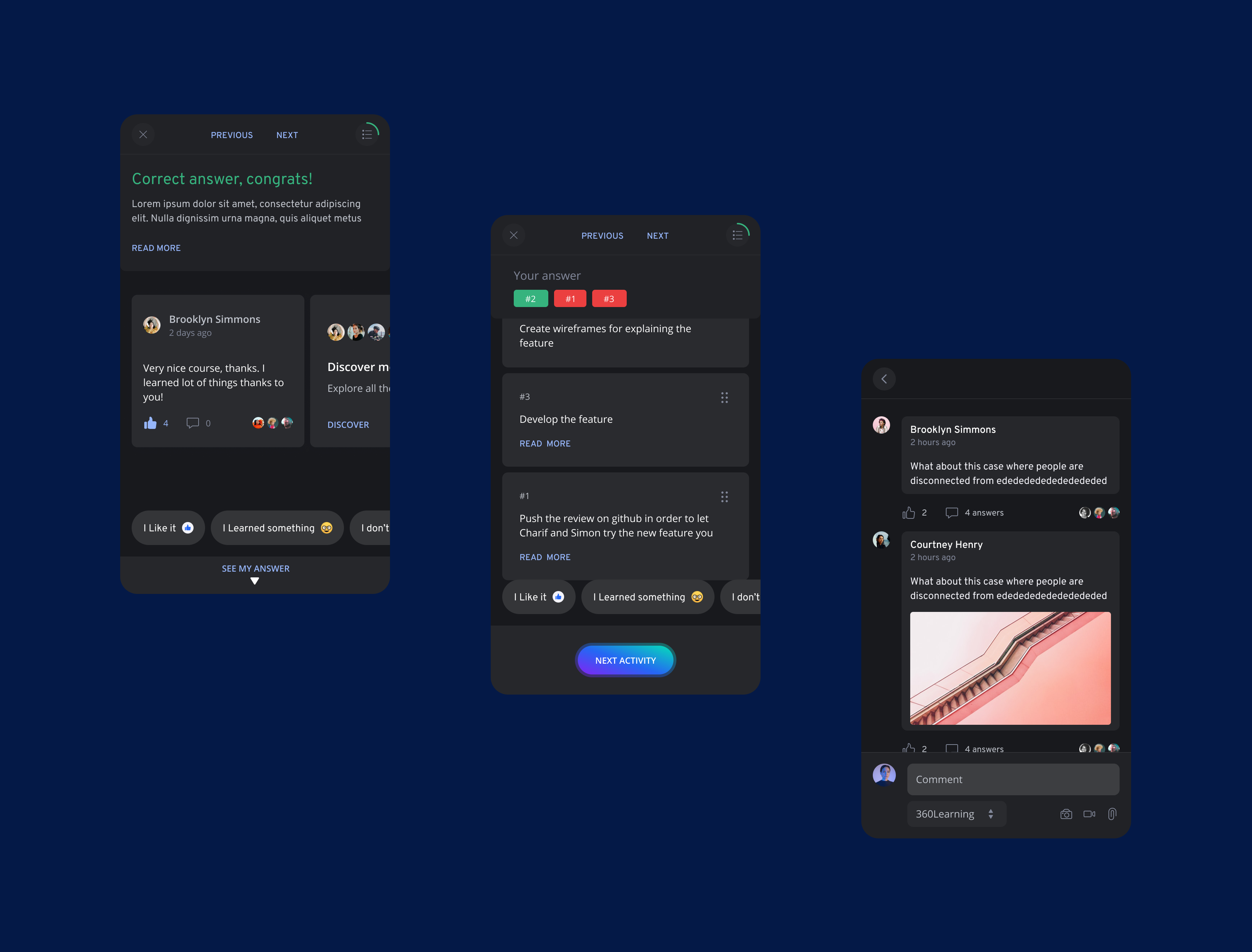
Correct answer, Correction, Forum
Key Results
In order to know if the new player was a success, we decided to track the number of activities
played on mobile per user.
Number of activities has been multiplied by 1.7
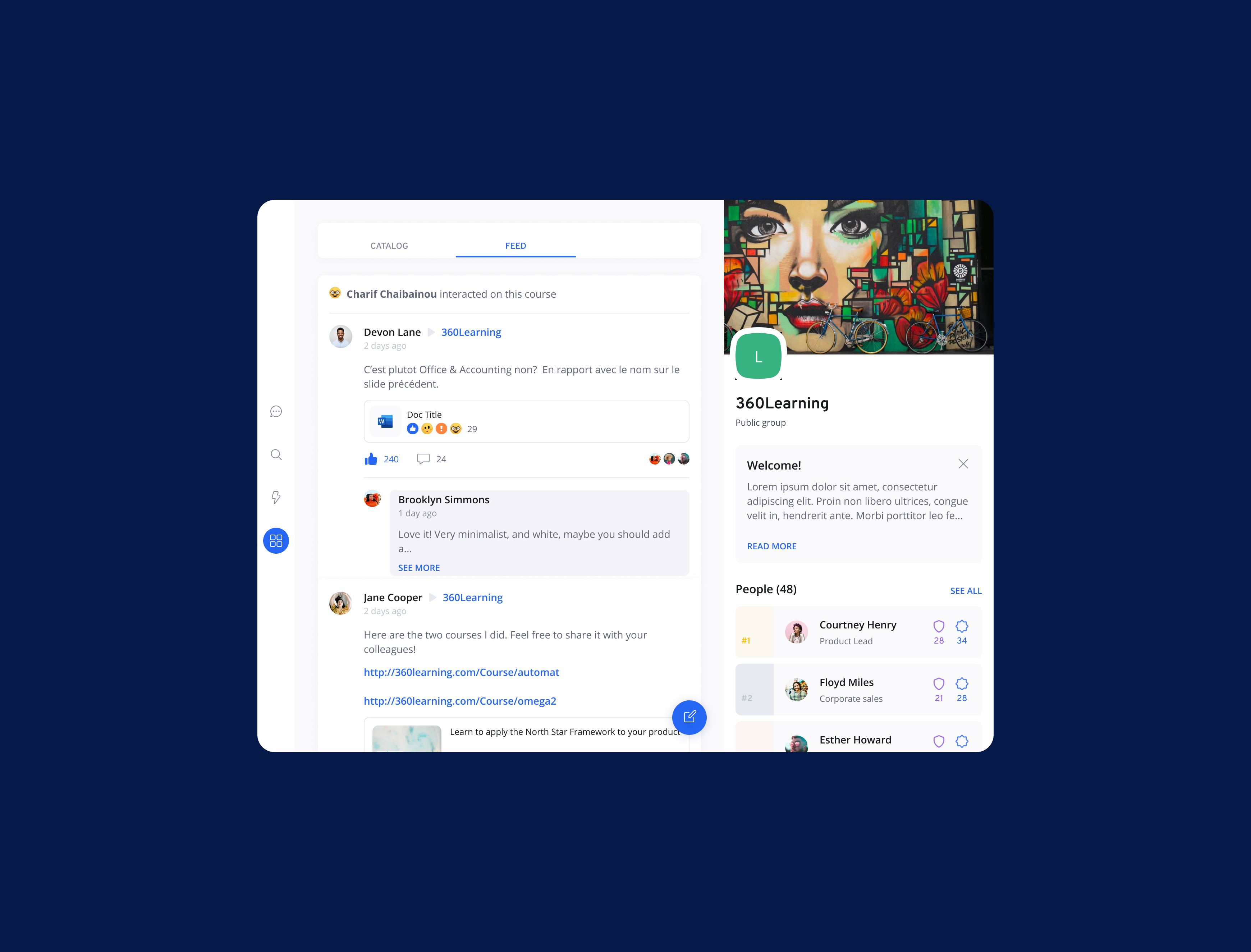
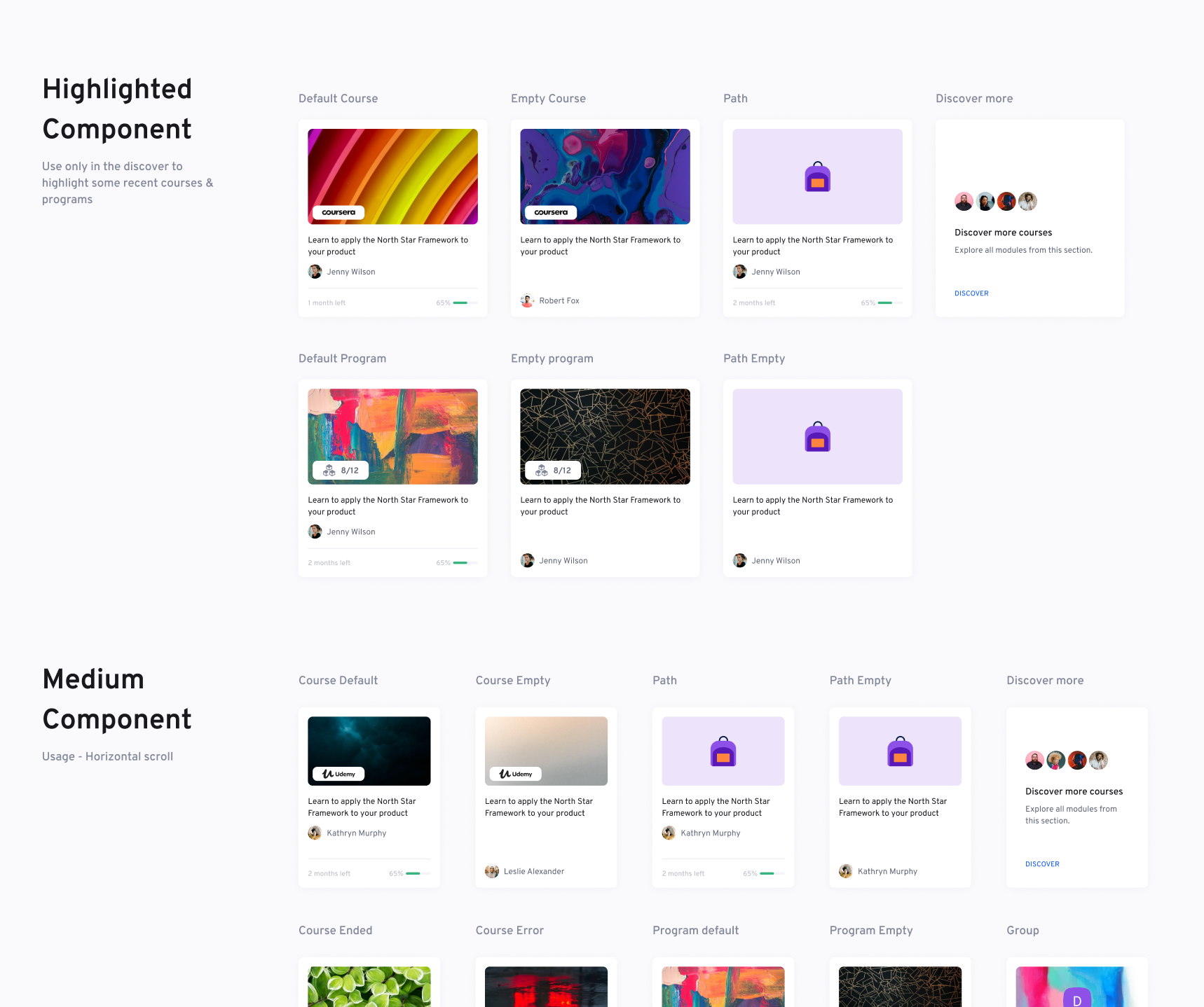
3. Design system to keep a coherent design everywhere
In order to keep consistency cross platform, we created 3 designs systems for the all the product; one for desktop, one for apps and one shared with colors, fonts and icons.
I was in charge of creating the designnsystem for the apps. With Figma, I created all the components using variants and auto layout.

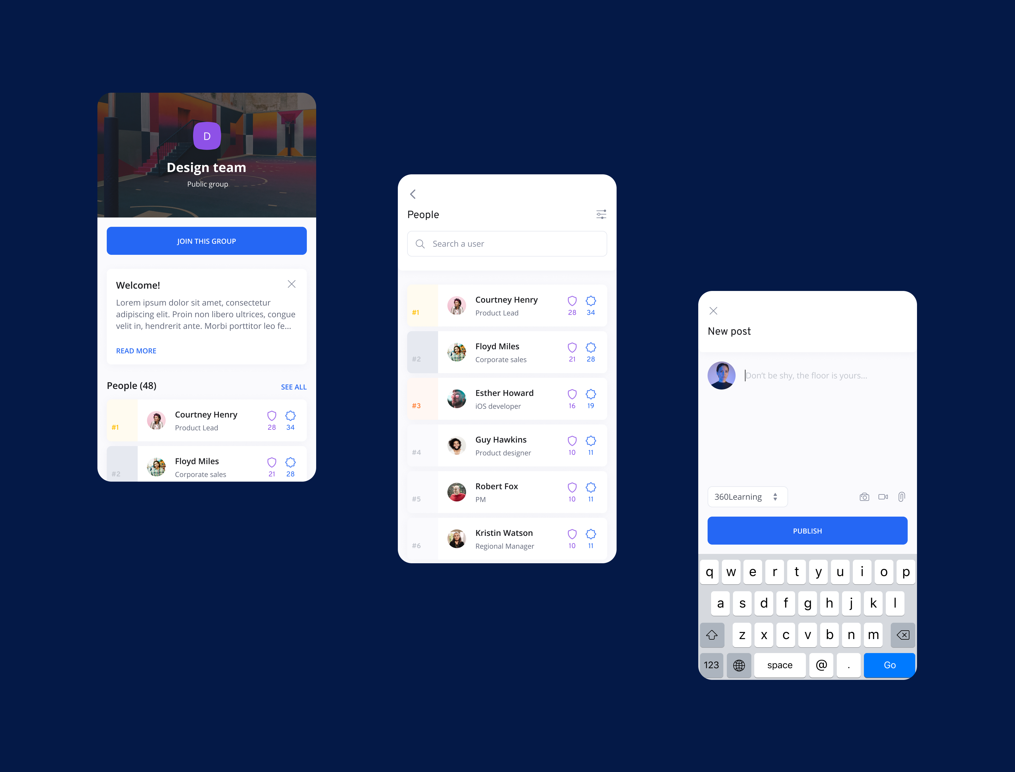
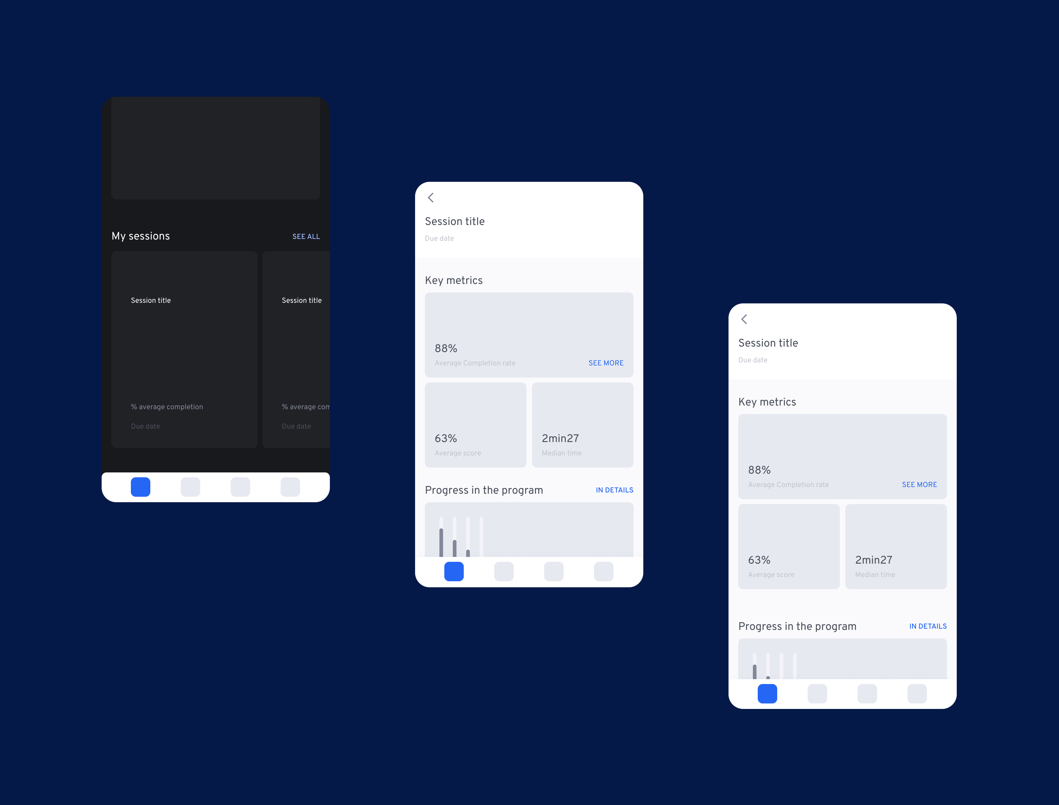
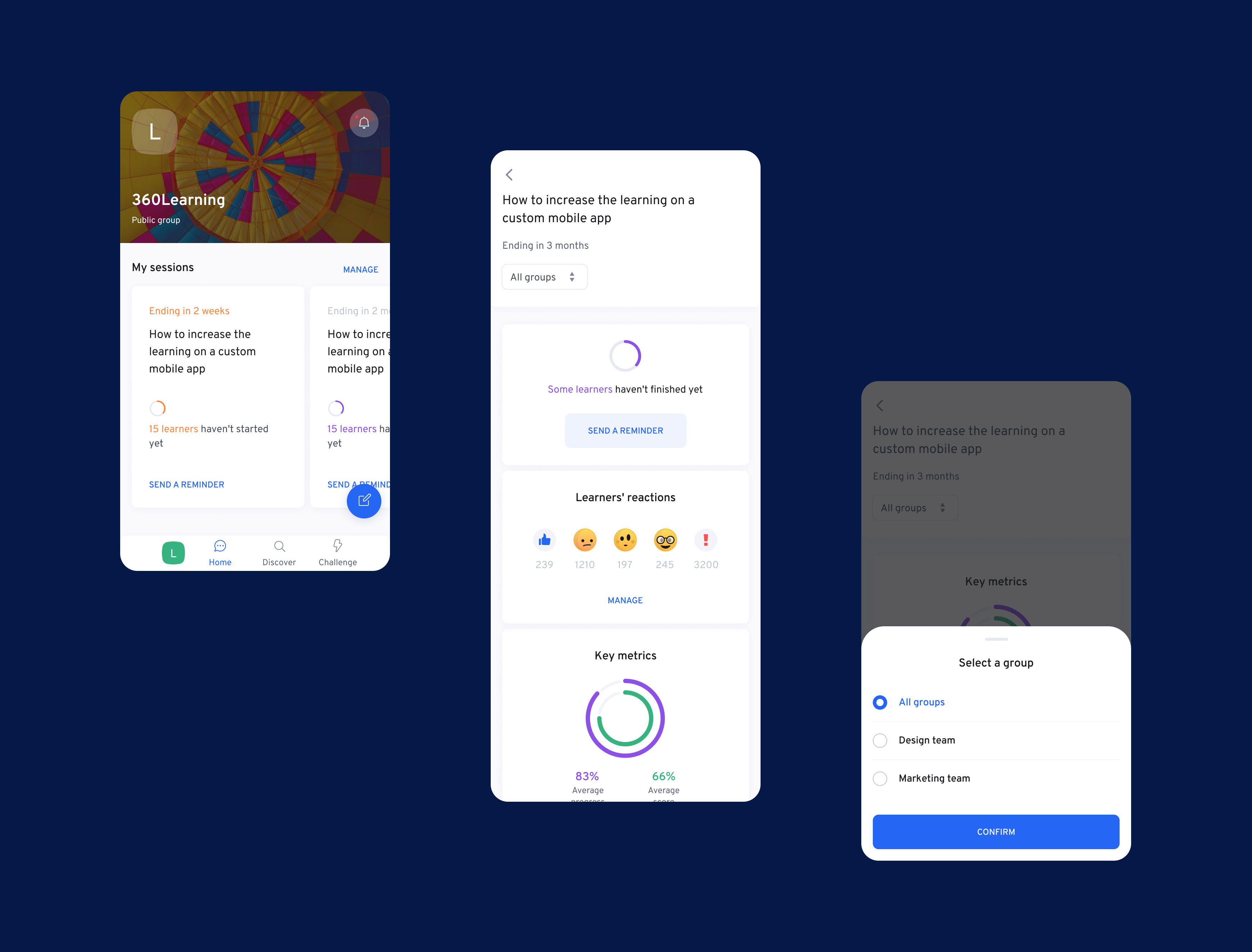
4. Integrate admins features inside 360Learning app
We have two major roles on the product :
A learner, who can play activities, comment, post a message,...
A coach or admin that creates courses, sessions, and can see datas and takes actions
On the app, we were focus only on learners. Admins and coaches can't take any actions from the app.
In order to change that, we decided to add the possibility to take some actions throught the app that will help them to follow their learners in an intuitive way.
Wireframes
Datas in app
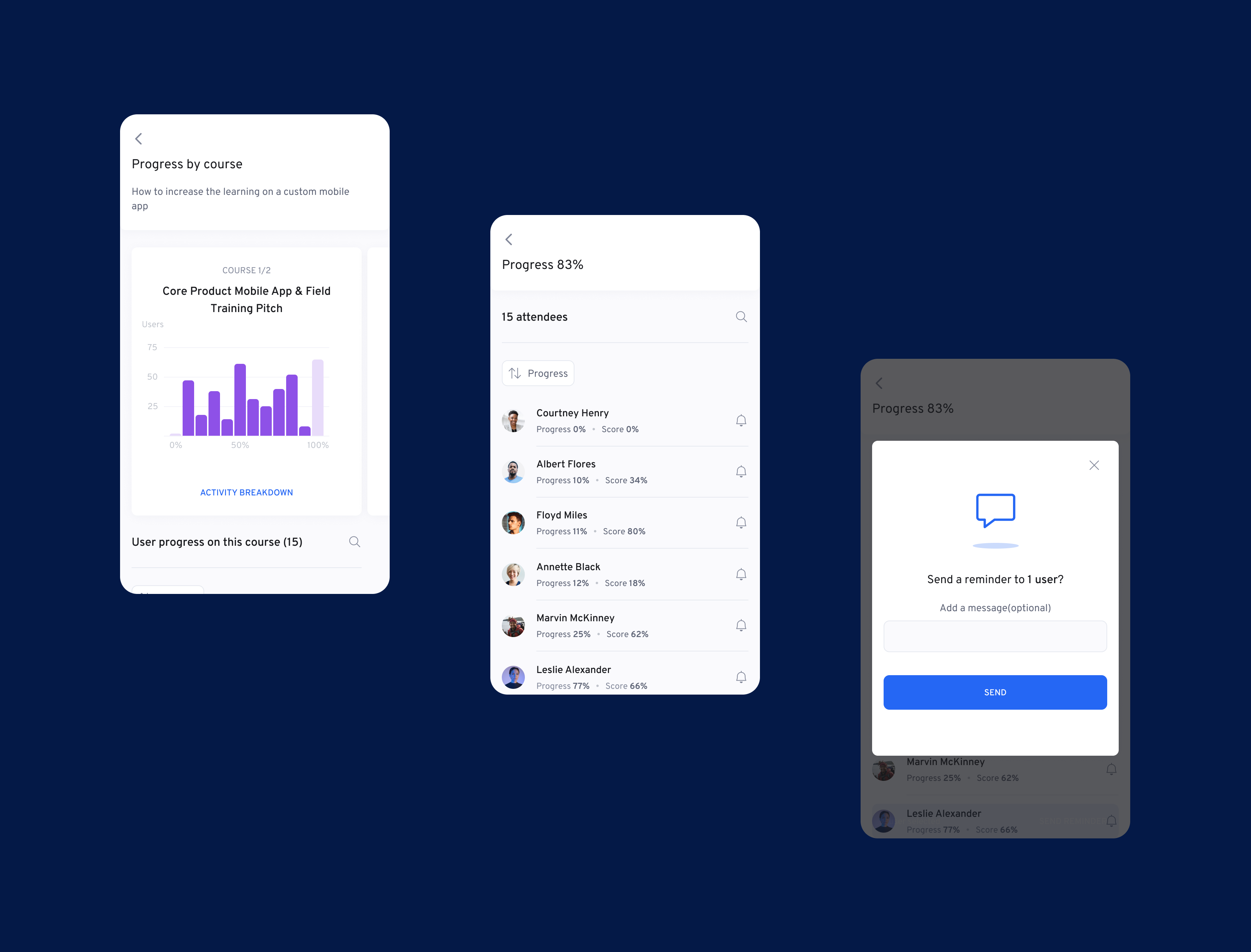
How to send a reminder from the app
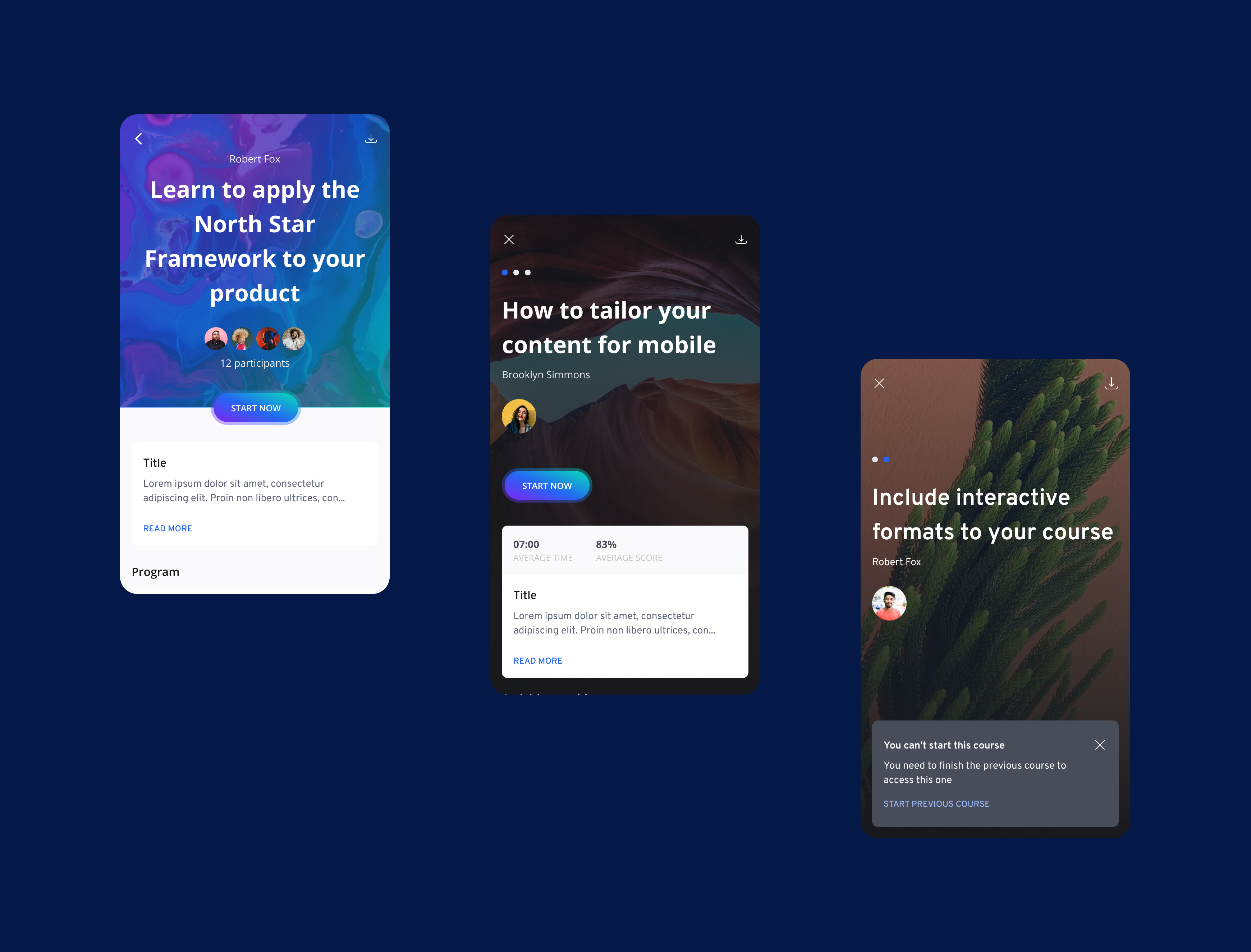
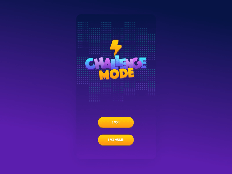
5. Introduce gamification in the app
In order to increase engagement in the app while learning, we decided to launch a new way of gamification, challenge mode.
You can now create a challenge on the mobile app, and challenge one or multiple users on a course.
Design exploration
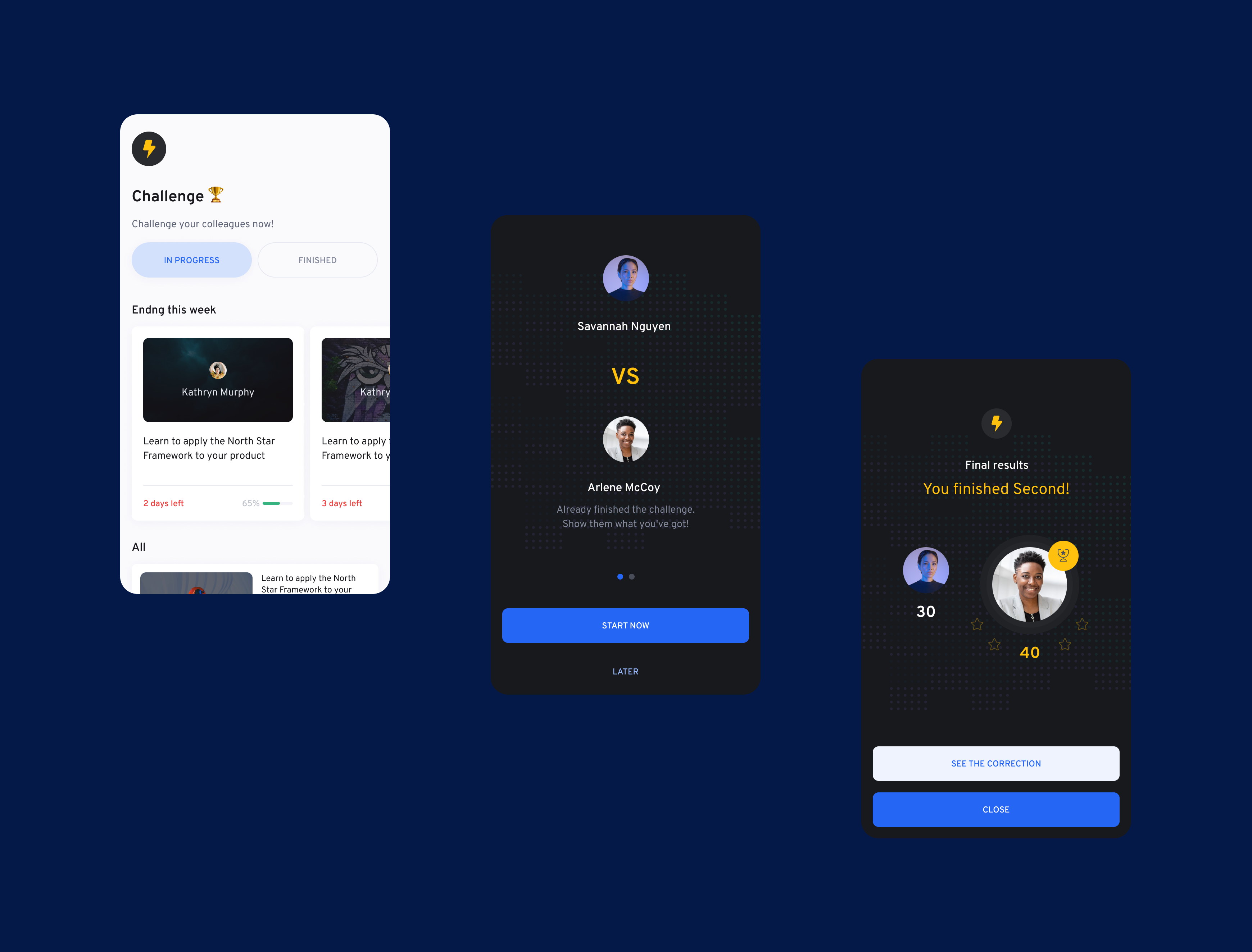
Screens from Challenge mode
Create a challenge in 3 steps

Challenge - Duel

Challenge - Multiple Users
6. Tablet screens
Few screens made for the tablet app